> ## Documentation Index
> Fetch the complete documentation index at: https://docs.onsomble.ai/llms.txt
> Use this file to discover all available pages before exploring further.
# Overview
> How to read your headline AI discoverability results and decide what to investigate next.
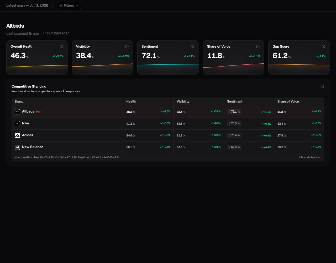
The **Overview** is the starting point for understanding how your business appeared in the latest scan. It brings together five headline metrics and a comparison with your tracked competitors.
Use it to answer two questions:
1. How strongly did the business appear in the AI answers we measured?
2. Which result should I investigate in more detail?
 ## How a scan becomes results
Each active prompt runs against every enabled AI model and region. Each resulting answer is one measured response. Onsomble checks which brands appeared, where they appeared, how they were described, and which sources were shown.
The Overview combines those responses into a summary. The other pages under **Insights** let you inspect the prompts, brands, descriptions, and sources behind it.
Your results describe the prompts, models, regions, and time period included
in the current view. They are not an estimate of every AI answer a customer
could receive.
## Before your first scan
A new Site starts with an empty Overview that guides you into scan setup. Results appear after the first scan completes. While a scan is running, the Insights pages show its progress and refresh when it finishes.
## The five headline metrics
| Metric | What it tells you | How to read it |
| ------------------ | -------------------------------------------------------------------------------- | --------------------------------------------------------------------------------------------------------------------------------------------------- |
| **Overall Health** | A combined score based on Visibility, Share of Voice, and Sentiment | Higher is better. Use the three component metrics to understand why it moved. |
| **Visibility** | The percentage of measured responses that mentioned the brand | Higher means the brand appeared in more of the answers you measured. |
| **Sentiment** | The average tone of what the responses said about the brand, on a 0 to 100 scale | Above 50 means favourable language, 50 is neutral, and below 50 means unfavourable language. A dash means there was no sentiment evidence to score. |
| **Share of Voice** | The brand's share of all measured brand mentions, including tracked competitors | Higher means the brand received more of the attention within the answers. |
| **Gap Score** | The percentage of measured responses that did not mention the brand | Lower is better. It is the inverse of Visibility. |
See [Understanding metrics](/results/understanding-metrics) for the calculation, a worked example, and the limits of each metric.
## How to read changes
When at least two comparable scans are available, each metric can show how far it moved since the previous completed scan.
* A change from 38 to 41 is a rise of **3 points**.
* An increase is favourable for Overall Health, Visibility, Sentiment, and Share of Voice.
* A decrease is favourable for Gap Score because lower is better.
* A dash means the current selection does not contain enough data for that result.
A movement is a reason to investigate, not proof of what caused it. Prompt, model, region, and competitor changes can all affect the result. AI providers can also change how their systems answer questions.
## A useful first-scan reading order
Compare several views before deciding what a result means:
1. **Start on the Overview.** Check whether the business appeared and how it compares with tracked competitors.
2. **Open [Prompt Results](/results/prompt-results).** Find the important questions where the business was missing or poorly positioned, then read the answers.
3. **Check the [Brand Scorecard](/results/brand-scorecard).** Compare the business with each competitor and, after later scans, review the trends.
4. **Read [Narrative](/results/narrative).** See the strengths, concerns, and decision factors AI assistants associated with the market.
5. **Review [References](/results/references).** See which websites and pages appeared alongside the answers.
6. **Use [Region Exploration](/results/region-exploration)** if the prompt set covers more than one market.
7. **Finish with [Recommendations](/results/recommendations).** Check the evidence behind the suggested actions and decide what belongs in your plan.
## Tracking results over time
Trend views preserve completed scans so you can compare results after publishing content, correcting information, or changing positioning.
Treat a change in the next scan as evidence to investigate rather than proof that your work caused it. Look for a pattern across several scans, check individual prompts, and compare whether competitors and models moved in the same direction.
Trend charts mark changes to the scan setup, such as prompts, models, or competitors being added or removed. A result before the marker was measured with a different setup, so compare it with care.
## What's next
See how every result is calculated and what it can tell you.
Read the individual questions and AI answers behind the headline results.
Compare brands and follow the five headline metrics over time.
Narrow results by time, prompt details, model, or region.
Investigate the Site's results with grounded questions and follow-ups.
## How a scan becomes results
Each active prompt runs against every enabled AI model and region. Each resulting answer is one measured response. Onsomble checks which brands appeared, where they appeared, how they were described, and which sources were shown.
The Overview combines those responses into a summary. The other pages under **Insights** let you inspect the prompts, brands, descriptions, and sources behind it.
Your results describe the prompts, models, regions, and time period included
in the current view. They are not an estimate of every AI answer a customer
could receive.
## Before your first scan
A new Site starts with an empty Overview that guides you into scan setup. Results appear after the first scan completes. While a scan is running, the Insights pages show its progress and refresh when it finishes.
## The five headline metrics
| Metric | What it tells you | How to read it |
| ------------------ | -------------------------------------------------------------------------------- | --------------------------------------------------------------------------------------------------------------------------------------------------- |
| **Overall Health** | A combined score based on Visibility, Share of Voice, and Sentiment | Higher is better. Use the three component metrics to understand why it moved. |
| **Visibility** | The percentage of measured responses that mentioned the brand | Higher means the brand appeared in more of the answers you measured. |
| **Sentiment** | The average tone of what the responses said about the brand, on a 0 to 100 scale | Above 50 means favourable language, 50 is neutral, and below 50 means unfavourable language. A dash means there was no sentiment evidence to score. |
| **Share of Voice** | The brand's share of all measured brand mentions, including tracked competitors | Higher means the brand received more of the attention within the answers. |
| **Gap Score** | The percentage of measured responses that did not mention the brand | Lower is better. It is the inverse of Visibility. |
See [Understanding metrics](/results/understanding-metrics) for the calculation, a worked example, and the limits of each metric.
## How to read changes
When at least two comparable scans are available, each metric can show how far it moved since the previous completed scan.
* A change from 38 to 41 is a rise of **3 points**.
* An increase is favourable for Overall Health, Visibility, Sentiment, and Share of Voice.
* A decrease is favourable for Gap Score because lower is better.
* A dash means the current selection does not contain enough data for that result.
A movement is a reason to investigate, not proof of what caused it. Prompt, model, region, and competitor changes can all affect the result. AI providers can also change how their systems answer questions.
## A useful first-scan reading order
Compare several views before deciding what a result means:
1. **Start on the Overview.** Check whether the business appeared and how it compares with tracked competitors.
2. **Open [Prompt Results](/results/prompt-results).** Find the important questions where the business was missing or poorly positioned, then read the answers.
3. **Check the [Brand Scorecard](/results/brand-scorecard).** Compare the business with each competitor and, after later scans, review the trends.
4. **Read [Narrative](/results/narrative).** See the strengths, concerns, and decision factors AI assistants associated with the market.
5. **Review [References](/results/references).** See which websites and pages appeared alongside the answers.
6. **Use [Region Exploration](/results/region-exploration)** if the prompt set covers more than one market.
7. **Finish with [Recommendations](/results/recommendations).** Check the evidence behind the suggested actions and decide what belongs in your plan.
## Tracking results over time
Trend views preserve completed scans so you can compare results after publishing content, correcting information, or changing positioning.
Treat a change in the next scan as evidence to investigate rather than proof that your work caused it. Look for a pattern across several scans, check individual prompts, and compare whether competitors and models moved in the same direction.
Trend charts mark changes to the scan setup, such as prompts, models, or competitors being added or removed. A result before the marker was measured with a different setup, so compare it with care.
## What's next
See how every result is calculated and what it can tell you.
Read the individual questions and AI answers behind the headline results.
Compare brands and follow the five headline metrics over time.
Narrow results by time, prompt details, model, or region.
Investigate the Site's results with grounded questions and follow-ups.