

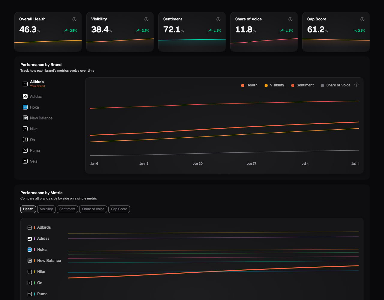
Start with the metric cards
Choose a brand to see its latest:- Overall Health: the rounded average of Visibility, Share of Voice, and Sentiment
- Visibility: the share of measured responses that mentioned the brand
- Sentiment: the average tone of the brand’s mentions, on a 0 to 100 scale where 50 is neutral
- Share of Voice: the brand’s share of all measured mentions across tracked brands
- Gap Score: the share of measured responses that did not mention the brand; lower is better
Compare one brand over time
Performance by Brand plots Overall Health, Visibility, Sentiment, and Share of Voice for the selected brand. Choose your business or a competitor from the brand list to change the chart. Use this view when you want to ask:- Did our Visibility continue to improve after we changed the website?
- Is a competitor’s Share of Voice rising across several scans?
- Did Sentiment move while Visibility stayed stable?
Gap Score is not shown as a separate line in this chart because it is the
inverse of Visibility. Plotting both would show the same movement in opposite
directions.
Compare every brand on one metric
Performance by Metric lets you choose one metric and compare all tracked brands on the same scale. This is the better view for questions such as:- Which brand appears most often?
- Who has the largest Share of Voice?
- Is our Sentiment improving faster than a competitor’s?
- Which brand has the lowest Gap Score?
Understand the trend markers
Vertical markers show when the scan setup changed. This can include prompts, models, regions, or competitors being added or removed. For example, Visibility might rise after five new prompts were added. The rise is real within the new scan, but it is not a like-for-like comparison with the result before the marker. Read the prompts and the configuration change before attributing the movement to business activity.What to look for
- A repeated movement after a change you made. One scan can vary. A pattern across several scans is more useful evidence.
- A competitor improving on several metrics. Open that brand, then use Prompt Results and References to see where it is appearing and which sources accompany it.
- One model moving differently from the others. Apply a model filter to check whether the change is isolated to one assistant.
- Every brand moving together. This may indicate a model or measurement change rather than something specific to one business.
What the scorecard cannot tell you on its own
A trend tells you what moved, not why it moved. Before taking action, check the individual prompts, underlying answers, and scan-configuration markers. A higher score also does not guarantee more traffic, enquiries, or sales.What’s next
Prompt Results
Inspect the questions and responses behind a surprising movement.
Narrative
See the strengths, concerns, and decision factors behind the scores.
Competitors
Manage the tracked businesses included in the comparison.
Filtering dashboards
Compare a specific model, market, product, or group of prompts.